
Bringing Shape and Color to a Book Cover’s Blank Canvas
By Tom Bentley | October 6, 2017 |
Book covers are influential. When I saw Abbie Hoffman’s Steal This Book in the store, I stole it immediately. (Abbie, thank you for not titling your book Eat Your Poop.) I’ve been motivated and moved by cover artistry many times, so much so I’ve paid for books about which I knew little other than their cover’s invitation.
There are seemingly endless combinations of illustration, typography, geometry and color that simply click that “yes!” in our heads—the cover is something felt, it paints an inviting dimensional landscape in our imaginations.
And then there are covers that are like eating poop.
When I slapped awake an old novel that had been Rip Van Winkling in my mind’s grotto, and decided I might self-pub it, I concluded my ability to draw only stick men—stick women, out of the question—was a stopping point. So I engaged the services of Alicia Neal, a woman who had illustrated the cover for a spectacularly unpublished collaborative novel of mine. She had done compelling work on that, so we began the email dance of grubby, obscurantist author and genial, accommodating designer to come up with an expressive, irresistible cover. (I gravitated toward Steal This Book as the title, but worried about copyright.)
After confirming that she’d like to work on the design and setting up a tentative timeline, I sent her the query, synopsis and first fifty pages of my novel, Aftershock. Those pages introduce the reader to the three main characters of the work, who are unceremoniously tossed together by the 1989 San Francisco earthquake. The landing after the tossing doesn’t go well, but that’s fiction for you.
So, what follows is a condensed—and it’s still way long for a standard WU post—exchange of our emails and the images of the developing cover, which evolved from rough sketches to a lovely thing. If this whole piece is tl;dr, just breeze through the images while sipping from an umbrella drink.
After reading the novel’s beginning, here’s what Alicia wrote back:
I read through everything you sent me. I thoroughly enjoyed the first 50 pages, and I’ve been working on concepts all weekend but I have to admit I’m a bit rusty, the visual inspiration hasn’t quite hit me yet. I’m leaning toward something that plays on the theme of the earthquake: a destructive force, uniting the paths of three very different people (unity through division, or order from chaos, etc.). I’m still working on getting you thumbnail sketches in the next couple days, but when you have the time to take some photos in the bookstore like you mentioned, that would be a huge help.
Here’s some of my response (which is embarrassingly vague), to try and kick off the process:
I guess a stereotypical image might have the Golden Gate Bridge in it, though it was the Bay Bridge that was damaged by the quake, though bridge damage doesn’t figure greatly in the story. Downtown San Francisco does.
I didn’t have any great starting ideas, other than maybe having the “A” in the Aftershock title be cracked as though it were from earthquake damage. But that might not be that original either. Anyway, I’ll try to get some covers for you a bit later in the week and try to think of any other themes that might be of help.
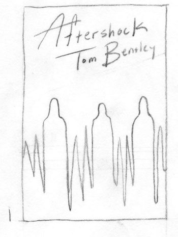
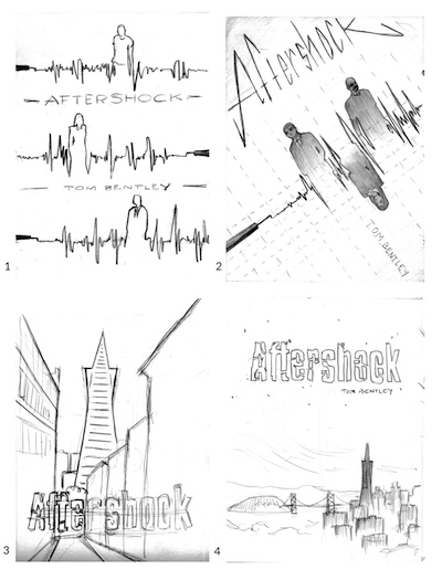
I spent about 45 minutes in my local bookstore, and I sent her 12 images of covers that appealed to me on various levels, with short explanations of why. To give you a capsule sense of my 12 cover samples, here are 3 of my 12 thumbnails, with brief comments about what struck me in seeing them.
1 – mood is rich, scene evocative
2 – Again, the simplicity of the stark illustration; like the use of type accent on “of”
3 – like the “old school” feel of this, though probably not the script type (though I like it)
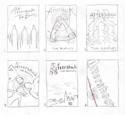
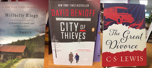
After reviewing my cover samples and notes, she sent me 6 preliminary sketches—the above main image for this page—with these comments (slightly condensed):
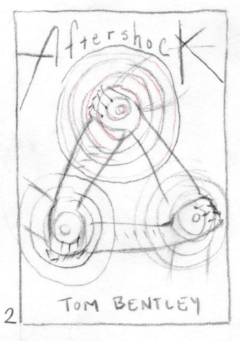
1. This is based on a seismograph reading, the idea being that the line the needle draws could form the suggestion of three figures representing the main characters. In a final version I would elaborate a bit on the shape of the figures, adding some very light shading to suggest facial features, but keeping everything fairly ambiguous. I may also work the seismograph needle into the design somehow, to make it more clear that’s what it is. The font on this would be a loose handwritten style, meant to mimic the bouncy lines of the reading.
2. The three arms of the characters clutch one another to form a triangle, a symbol of strength. I would use radiating circles commonly used to illustrate the epicenters of earthquakes over each point of the triangle to imply that each character, and their relationships with one another, are the focal points of the story/that they are at the center of all the chaos.
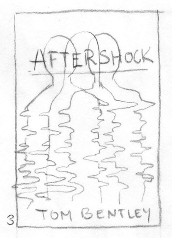
3. The outlines of three figures that blur and bleed into one another. I envisioned this one to be just outlines, each one in a separate color to differentiate them. So, they might be red, blue, and yellow lines, but at parts blur together into oranges, yellows and greens. This partly references seismograph readings, but more so evokes shaking/instability.
4. Silhouettes of the three characters lay about, like they’ve been tossed to the ground. Their heads come together to form the epicenter of the quake.
5. A very understated suggestion of the San Francisco skyline done in muted colors, with a large moody open sky and three very small figures in the foreground accented in a bolder color. The type would be also be done in this bolder color (a red or orange), and in this sample, features an A that’s been cracked.
6. A map view of the California coastline, with the epicenter at San Francisco, and a bold line running through the San Andreas fault. This is a pretty simple concept so the type design for the title would take center stage.
Because I am insightful (and needful of typing the word “condoms” in an email), I responded thusly:
Alicia, your approaches all have creative zest—nice work (and nice work investigating aspects of the work for the design). I admire elements of all the work, but the two I am most drawn to are #1 and #5. I like the mingling of the human figures with the seismograph reading (though the humans do look a bit like condoms in the sketch) and I very much like the title treatment, though my name might be too large.
It might seem weird that I also like the much more figurative cityscape work in #5, but I do, as well as like the type in that one, which is so different from #1.
Are the lines around the type in #5 going to suggest movement? And perhaps the “A” could be tilted? I like the idea of the human figures too, though it might be difficult to have them rendered with any clarity. I also like the stark drama of #6, but maybe I shouldn’t even mention that one, since I can’t seem to pin down a single one as the most resonant for me. But that must mean you have widely expressive talent, right?
Anyway, hope my remarks aren’t too vague or scattered. Have I given you anything to go on?
Alicia got on it (and complimented me, which I never fall for, except always):
This is great feedback! Since you’re a little bit torn between the ideas, I think what I’ll do is a round of slightly larger, more detailed drawings exploring layout options for both. Being able to fine tune some elements of the design will help us both have a clearer picture of the final image. I’ll get to work on this tonight, and send you the drawings by tomorrow.
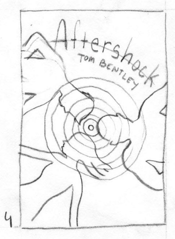
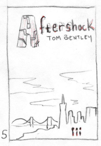
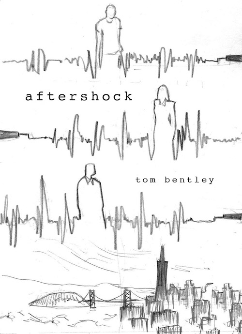
The next day, there were these images, along with this comment:
OK, so I wanted to give you a few options on how both of the ideas that you were drawn to could be elaborated upon with layout and type design.
1. Breaking the seismograph into three unique “storylines”
2. I added the needle, some paper texture, rendered the figures a bit, inverted one to make them fit together better (which also mimics the shape of the seismograph reading more), and tilted the whole thing to make it dynamic/energetic layout/type, but with these more defined figure shapes rather than condoms, haha).
3. I realized your comment regarding the tiny figures in the skyline image was true, it would be very difficult to make them look like anything recognizable. Rather than do the distant skyline, I thought I could pull it in to street level and that would make it easier to add figures, but as I was doing the sketch I realized a finished version of this would be extremely time-consuming, as it is a fully painted scene rather than just a few illustrated elements. I’ve included it here (without the figures) just as an example, with the caveat that if we went in this direction I may need to charge more.
4. The skyline image again, sans figures, with more focus on the broken type. The layout leaves a lot of focus on the type treatment, which we can workshop any way you’d like, to add movement, emphasize mood etc.
Because I know style (I once owned a Banana Republic shirt), I countered with this:
Hi Alicia. Hope I’m not bugging you, but I wanted to clarify that I’m fine if the images of the people are indistinct in regards their facial features, like in image #1, because then the readers can assign their own faces. Though, contrary as I am, I enjoyed the deeper renderings of the faces that you did in the tilted image too.
And on the cityscape, as I said, don’t add it if it seems too much, but perhaps some portion of it (the bridge?) that indicates San Francisco could work. But again, if it’s too much information, or it seems to conflict with the seismograph image, don’t worry about it.
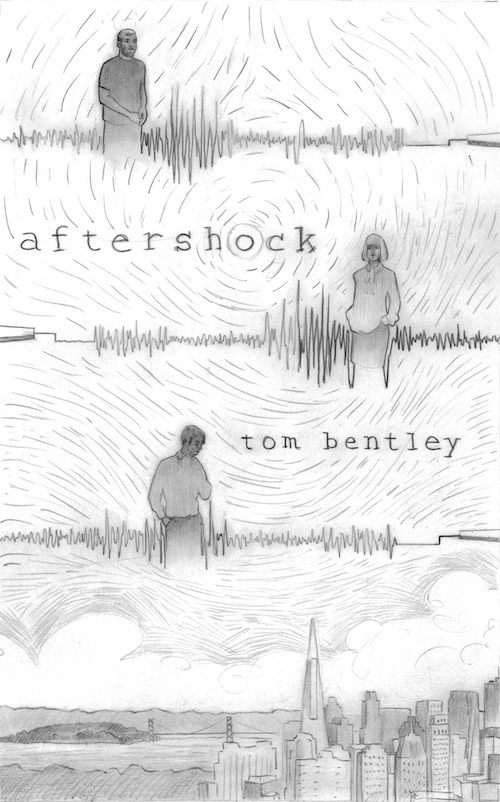
Alicia, wondering if the guy on the other end of these emails might be a narcissistic popinjay, but still willing to go along, responded cogently, with kicking illustrations too.
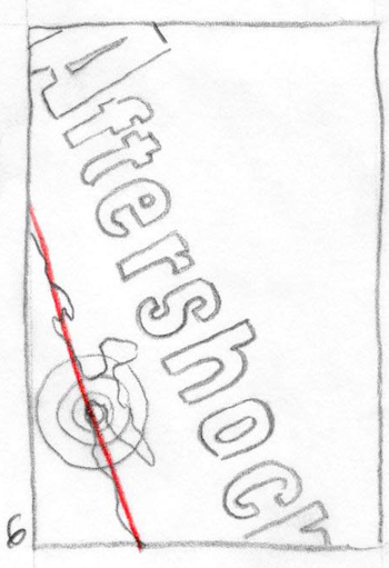
I’m sorry for the delayed response. I’ve been mulling over your points for a few days, trying my best to come up with a way to incorporate both the cityscape and the seismograph concepts together in a way that makes sense. The best I could come up with is just to add the skyline to the bottom of the “three storylines” idea, like this. Initially I was hesitant to do this, since with the original ideas there was a contrast in the tone of each (the seismograph reading being a bit simpler and more bold, and the skyline being a bit softer, moodier) that I didn’t feel meshed very well. That said, it might actually be nice to add some depth/color/weight to an otherwise very stark linear design.
So, if we were to go forward with this, I would make the skyline somewhat muted, hazy … to make the lines of the seismograph readings pop off the page. I would also leave the type very simple to avoid making the overall design too busy.
What do you think?
I have long been a sucker for seismographs and muted skylines, but yet I could do nothing but complain about collars:
Alicia, I like it a good deal and I’m good with making the skyline muted to have the seismograph pop. As for the type, I like the understatedness of the lowercase letters. However, both the title and my name have to be bigger, or no one will be able to read them at an Amazon book-page thumbnail size. Can they be adjusted up (keeping the same letterforms) without it being a problem?
Again, I like the figures in the seismograph, but the collar on the third fellow below is too big (it kind of looks like he has a suit with a bow-tie to me). If we can make it look more like a modern button-down shirt that would be better.
Otherwise, looking great!
A paragon of rationality, Alicia pinged me back, with a more fully realized sketch:
Hi Tom, I was able to do a larger, more detailed drawing of the idea, attached here.
I’ve changed the shapes of the characters a bit, hopefully more to your specifications. The title and your name are a smidge larger than they were in the thumbnails, though there is still some room to go a little bigger if need be.
A note about the lines in the background: As I was drawing I was starting to feel like the composition overall was very static and could use some texture/motion. The lines wouldn’t be nearly as overwhelming as they are in the drawing. I would want to keep them very muted like the city skyline to allow the seismograph readings to pop as I mentioned before, and the way that I envision them looking in the final piece would be as two very subtly different shades of sky blue or blue-gray.
I can of course leave this out of the background entirely if you think it might be too busy. Let me know your thoughts, I can make any changes and then get started on the final this week.
Because clarity unsettles me, I had to argue for murk:
Hi Alicia. The cover is progressing well: I like the motion lines and the color integration, though I’d probably have to see all colors you will work with for the cover to understand how it will all coalesce. I’m of a split mind over the clarity of the faces and appearance of the protagonists.
It might be better not to have their faces sharply realized, because perhaps that might take away from the reader’s imagination. But human faces are appealing, so I like them. However, in the instance of the top guy, the homeless guy, he’s actually a 50-something black guy, described in the book as having black hair streaked with gray, and in a very short afro style.
So, the image as rendered doesn’t reflect the character in the book. And the woman has longish blond hair in the book, a bit lower than her shoulders and she’s fairly short, so she isn’t quite right either. The lower guy does work fairly well. So, I’m not sure if it’s better to mute out those distinguishing characteristics or make them much closer to the book’s depictions. What do you think? I can search the book for any hints of their appearance if you want to go the close-appearance route.
And the title and author name are better, but they probably need to be a touch bigger, and “Aftershock” lettering should be bolder.
The woman is a flexible thinker (and ooh-la-la, I’m liking the thinking):
After you mentioned the title should be a bit bigger, I decided to reduce the drawing I had done down to a smaller size and compare it with what Amazon uses on their main page to see how the layout reads … and damn was I off! Apologies for not having done this already, it didn’t occur to me the title would be so illegible.
Also, in light of this, I think it’s better to not render the faces with any detail, since nothing would show up at the small size, and wouldn’t even really be readable at the full size. (If you wanted to go to print in the future and think faces would be good in a print version, they could always be added later on.)
So, without redoing the layout completely, I redrew it to
– move the female figure off to the right allowing more space for the title, and gave her longer hair. I do think the title reads OK at this point, but there is still some room to go a bit bigger.
– changed the figure of the veteran to include a bit more of an afro (a note on this: I’m very much unsure of how to make him look older with just a silhouette. I had thought about including a bit of the top of a crutch in one arm, but didn’t think that read very well).
If I’m not hitting this yet and you have a clearer idea of what he should look like, feel free to send reference photos my way). I chose a bolder, larger type.
Attached here is the adjusted drawing, as well as a quick tonal study (not actual colors, but an idea of how the finished painting will be in terms of dark/light.
Tom must fuss:
Alicia, I like the cover very much. No need to try and get the top man looking older or adding a crutch—it’s fine if it’s vague. I like the tonal feel too—how will the final rendering look/feel different? I do like how the white of the S.F. sky contrasts with the seismograph renderings above.
Two small things: no need to have that elaborate bow on the woman’s outfit—she is an office administrator/department head, but it was a fairly casual S.F. office, and she wouldn’t have that component to her outfits. And the lower male figure’s left arm looks cut off to me—is it supposed to be behind his back?
As for the title/author name, you might bump them up just slightly (or darken them more), but they look much better now than before.
Looking good—can’t wait to see the finals.
Alicia fussed with purpose:
Excellent, I’m glad we’re getting close.
On the lower male figure: in the reference photo I’ve been using, the man’s left arm is bent forward and his hand is up near his neck adjusting his tie. I had left out the details because I thought it would be distracting (but embarrassingly contradicted myself here by adding the blouse bow on the female figure).
I’m going to make some quick edits (remove the blouse bow, enlarge the type, and redraw the man so that both hands are in his pockets) and will send you the result.
[two days later]
Hi Tom, Here’s the drawing with the edits I mentioned, and additionally I added a few details to the upper male figure to make it look like he’s wearing a jacket instead of a t-shirt. Let me know if that suits the character, or if you’d prefer a simpler top.
If I can get your approval on this, I can get started on the final painting this week.
I left out this image, bacause the changes were fairly subtle. Here’s my response:
Alicia, I like it! I have no suggestions at all. Very much looking forward to how you’ll work with some color, because in black and white, it’s great!
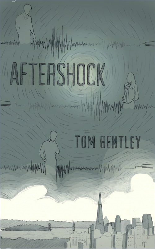
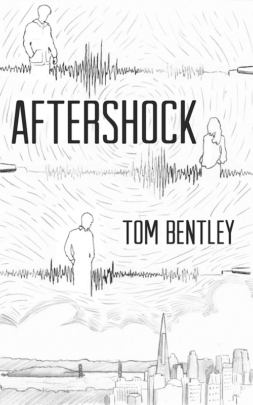
As for the final final—it’s the fanfare of angels. You see it here, with Alicia’s comments:
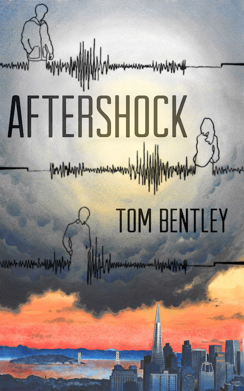
It’s finished! Attached are two sizes, one at the full size of the original painting (11×18 inches) and one at Amazon’s recommended size for ebooks (1600×2560 pixels).
The painting and the drawings of the seismograph/figures were done separately and then layered together in Photoshop, along with the text, which leaves us some wiggle room to move things around. So, if there’s anything you’d like tweaked in terms of the choice or size of the font, the placement of the text, or the colors, the contrast, etc, don’t hesitate to let me know.
We both agreed we were geniuses. I had agreed in advance of our discussion.
Of course, such assessments are subjective. My genius cover might be your brussels sprouts (which are, I’m sure you’ll agree, a profane atrocity). But the cover’s journey—from tiny stirring to full-color crescendo—is the thing here.
So, armed with a cover that sings, I’ll probably go the self-publishing route. But first, I’m doing one of those Kindle Scout things that will make me achingly famous. (Better talk to me now, before I’m too full of myself to answer.) If you would like to nominate Aftershock to be a Scout project, I’d be much obliged. (And you can unsubscribe from subsequent Scout solicitations, if they don’t apply.)
This was a learning process for me, and my goodness, Alicia indulged my nonsense and came up with something that is both art and a beckoning invitation into the novel’s story. A book, Rebecca Solnit memorably wrote, is “a heart that only beats in the chest of another.” This cover made my heart skip a beat, and I hope it moved you as well.
So, let’s get some coverage from WU: have you gone through this kind of process with an illustrator? Did you fuss as much as me? (Trick question: you only saw part of my communications.) Were you pleased with the cover outcome? Can you read the hidden message in one of the Transamerica building’s windows?
Tom Bentley is a novelist, essayist, and business and travel writer. (He does not play banjo.) He’s published hundreds of freelance pieces in newspapers, magazines, and online. He is the author of three novels, a collection of short stories, a how-to book on finding and cultivating your writing voice and a memoir of his sordid teenage criminality. His singing is known to frighten the horses. See his lurid website confessions at tombentley.com.


I enjoyed this post very much. I always enjoy seeing the creative process at work. Number one was my favorite from the get go.
David, agreed, the creative process is fascinating, and often not linear. (I was never good with straight lines anyway.) Interesting that you gravitated to #1 as well—I’m not sure what combination of closeted memories, strong coffee and artful longings made me move to that one, but I did.
I enjoyed getting a little immersed in the process between writer and graphic artist. I had no idea the designer would read the first 50 pages and get a feel for your book, but it makes sense. I liked the city scape immediately, though I kind of liked the smaller figures myself. Her painting is stunning, so much better than photos of models.
Hi Dana. I do think Alicia’s reading of the first part of the book was helpful, because there are a lot of San Francisco atmospherics in there that even if they aren’t a direct cover influence, stir some senses. Very much glad you liked the final!
What a fantastic post and a talented designer. Thanks for sharing this! I love the final product.
Thanks Erin. Yes, Alicia is dandy—check out her site to see the rich, cross-genre range of expression she has. And we are aligned on our feelings about the final product.
That was such a great post and I love the cover!!! The red really makes it pop and I’m so glad for the circle of light, otherwise it’d be dark and dreary. And happy to see that your people look like people and not a prophylactic. Congratulations!!!
Vijaya, thanks! I really responded as well to the contrast of the light in the central part of the image and that of the skyline, with the more somber tones. And yes, human condoms might make a fine advertisement for safe sex, but they aren’t beguiling elements in a book cover.
Thanks for the inside peek, Tom. (Happy to nominate you in KS.) This will be personally helpful for a book I’m in the process of writing that needs something different than stock-photo-derived cover art. I was wondering about the mechanics of the iterative process.
She seems to have captured your preferred aesthetic nicely.
Good move on making the font size larger! That’s absolutely necessary at the level of thumbnail views.
Jan, it has been an educational process for me as well. There’s both a Malcolm-Gladwell-like “Blink” aspect to registering what appeals to you immediately on a visceral level, and then ajudicating amongst more “rational” aspects, like type size, figure balance and the like.
I think she did a fine job understanding my inclinations, and glad you liked it too. (And thanks for the KS vote!)
And do let me know if you need any stick-man images for your book.
I haven’t gotten to the point of needing a cover yet, so I really appreciate you detailing all the back and forth that you went through with your great designer. And what a wonderful result you got, I’m impressed!
Joy, my thanks, and I’m sure Alicia thanks you too.
Wow! What a great cover, and a fascinating glimpse of the back and forth with the artist. Thanks for posting.
Doug, yes, and it’s interesting how things work in this world, since I’ve only “e-met” Alicia, never spoken to her, and only corresponded with her through email, and yet we were able to maneuver through this complex process and understand each other’s POVs pretty readily. (If only some of our governmental processes worked so well.)
Thanks!
Thanks for sharing this process, Tom. Hard work, inspiration and your final cover is awesome.
Thanks Beth. Well, mostly hard work for Alicia. I just got to be the art critic: “Picasso, the chicken that looks like a toaster with a party hat needs more blue.” Glad, muchly, you liked the cover.
Fascinating!
Although I have to disagree about the Brussels sprouts. If picked young and tender, steamed, and served with perhaps a tiny bit of melted butter, they’re bite-size portions of deliciousness.
Deborah, Deborah—we’ve got to be reasonable here. Brussels sprouts are an abject cruelty. When I try to think of a parallel for Brussels spouts, Satan’s testicles come immediately to mind. I agree they are best with a little bit of melted butter—and then served in a universe, far, far away. (OK, I’m breathing more regularly now.)