
Italics
By Dave King | November 15, 2022 |
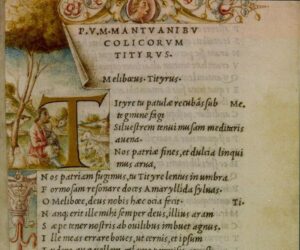
The 1501 Aldine edition of Virgil’s Aeneid, the first use of italics in print.
I try to not write much here about the mechanics of writing, such as how and when to use italics. I’m most interested in opening writers’ eyes to subtleties of the storytelling craft that they might not have noticed. There aren’t a lot of subtleties involved in how you use italics. It’s all pretty straightforward.
But after last month’s Onconference talk on dialogue, I could see there was still a lot of confusion about how and when to use italics. I think I need to step up.
First – and I can’t stress how important this is – there are no rules, not even with purely mechanical matters. When you try to handle italics by rote without paying attention to what’s happening in your story, you’re putting the rules ahead of the story. But if you treat italics as tools that, used properly. can help you tell your story more effectively, then your story is at the center of your thinking, where it belongs. So what can italics do for you?
First, your goal is to keep your mechanics transparent. As soon as readers notice how you’re telling your story, they’re no longer paying attention to your story. Which is bad. So however you use italics, you don’t want them to jump out at your readers.
What italics do best is mark some passage of dialogue or interior monologue as separate. The most common use – and the most misunderstood – is with interior monologue. Some clients have taken it as a given that all interior monologue should be in italics. The problem is that, when you mark off the interior monologue, then you’re saying that your narrative voice – the one you use for descriptions – is different from the viewpoint character’s voice – which is where interior monologue comes from. You’re putting distance between your narrator and your character.
Sometimes this is what you want – did I mention there are no rules? But more often than not, you want to forge an emotional bond between your readers and your characters. The best way to do that is to make your readers feel they’re seeing the action through the eyes of your viewpoint character. And the best way to do that is to let your readers move from what your character sees to what they think about it and back again without tripping over a change in typeface. Just keep the interior monologue in normal type and in the same tense and person as your descriptions – what’s true of italics for interior monologue is also true of a shift from past to present tense or from third to first person.
Another exception to this general principle? Italics can be handy to mark when your interior monologue is more like a dialogue. If a character is debating whether or not to do something, you can sometimes show that internal debate by putting one side of it in italics. If a character is praying a silent prayer, italics can be the way to go. And you can also use italics for something more unusual – say, telepathic communication or the interior monologue of animals.
If you do decide to use italics for something special, it’s a good idea to introduce whatever convention you’re using early in the story, then stick with it consistently from then on. Readers will give you some leeway in your techniques at the start, but after a chapter or two, they settle in to whatever approach you’re using. If you suddenly introduce some new technique in the middle of the book or shift from what you had been doing, then readers are likely to trip over your mechanics.
Italics are often used for emphasis, as well – as with the that a couple paragraphs ago. And while Renni and I warn in Self-Editing against overusing it, that occasional emphasis does reflect the way people speak. So you can get away with it from time to time. Also, I prefer italics to all caps. Why? BECAUSE I’M THE EDITOR, THAT’S WHY!! Seriously, it’s just a personal preference.
Italics is one of the oldest typefaces still in use. It was introduced in 1501 by a Venetian printer named Aldus Manutius, who also essentially invented books as we know them today – though that’s another story. Manutius used Italics for entire books, which can be a little hard to read. But given how handy they can be, I’d guess they’re going to be around for another half-millennium, at least.

Dave King has been editing for nearly 40 years now. He is co-author of Self-Editing for Fiction Writers, a former contributing editor to Writer’s Digest, and has contributed more than 100 articles over the last 12 years to Writer Unboxed. He lives on 25 acres in rural Massachusetts with his business partner and wife, Ruth Julian, who also edits his work. His other day job, at least on Sundays, is as the organist at a Lutheran church in Greenfield, Mass.
[coffee]


Not to distract from your main point, Dave, but the most handsome thing in the illustration above is the æ ligature, much more graceful there than in this typeface. A single over-and-under stroke of the pen and you’re done. One can imagine the patient scribe heaving a little sigh of relief, after placing all those angled spiky lines, relaxing (almost) into the fluid curves of the æ.
You’re right, that AE ligature is elegant.
Here’s the Aldine Press story. Before Aldus, printed books were deliberately designed to look as much like medieval manuscripts as possible. That’s what books were, after all. They were relatively large, had elaborate, heavy fonts, and often left large blank spaces at the beginnings of some paragraphs so you could take your book to the local manuscript illuminator and have illuminated capitals painted in. (That seems to be what happened to the image at the head of the article. Those colorful illustrations weren’t done at the Aldine press.)
Then came Aldus Manutius. Starting in the 1490’s, he began printing books that were small enough to fit into a pocket (octavo, for those keeping score at home), with straightforward, readable fonts, including italics. He led the way in producing books where the content was more important than the decoration — essentially, books as we know them today.
He was also a key figure in the Renaissance in other ways, creating the first Greek printed typeface and publishing Italian poets in the vernacular. After Aldus’s death, his family continued to run the Aldine press for nearly another century. His son, Paulus, was a recognized scholar in his own right and produced a critical edition of Cicero’s works.
Given their key role in the Renaissance, Aldine Press books can still be found at relatively affordable prices. There’s a 1548 copy of Paulus’s Cicero up on Ebay at the moment for $299. I don’t own any Aldines myself, but I do keep my eyes open for one that’s within a price range I’m comfortable paying.
Italics are special. They’re so pretty, but too many of them together and they get ugly.
What do you think about using them to show a cellphone text, Dave? I had a chapter where hero sends a brief text, gets a reply a few pages later. This repeats through the chapter. There are other things going on, btw, he’s not sitting watching his phone. My point is, in this case, it’s not enough to break the texts into a different indented paragraph, for just a word or brief sentence. But somehow the italics didn’t look right either. I ended up going with bold, but I’m not sure that was the best choice. Do we need a text font?
Ada, I’ve seen phone texts in small caps in separate paragraphs in novels. As a reader that works okay with me. I’d be interested in Dave’s opinion too.
Ada, you’re right about italics at length. They can get tiring. Presumably, Aldus’s readers found them easier to read than medieval Blackletter fonts.
As to your cell phone problem, this is one of those cases where you get to make up whatever convention you’d like. Just introduce it early, then stick with it consistently.
I would think italics might work, but I haven’t seen them on the page. You might want to try one of the sans serif fonts that often show up in texts and email (Calibri, say). I often go for Courier for typewritten passages within novels, since Courier was used in a lot of typewriters.
Yes, that’s a great idea. Thank you.
So helpful and a WU post to keep. I immediately went to my manuscript, and even on the first page, I am using italics to emphasize the memory of a warning, the memory of a phrase that haunts. So not sure if there would apply, but I will keep a copy of your post, go back and refer to it. Thanks so much, Beth
Thanks, Beth.
And there really are no rules. Italics might be right for the emphasis you’re going for. I think it depends a little on how long the passages are and whether that emphasis is tied to a specific character’s feelings. As always, it depends on what you’re trying to do with your story at the moment.
I’m wondering whether italics can solve the following problem. I plan to include a glossary at the end of my novel, because there is a lot of specialized language. I’m thinking of setting in italics any word that can be found in the glossary, but only the first time it appears, not thereafter. The other option is to not typeset those words differently at all, and simply leave it up to the reader to check the glossary.
Hey, Christine. Dave might have another perspective, but I recommend italics for the first mention of an industry term or specialized language to my editorial clients. While this mostly holds for nonfiction, the same could apply for fiction when a glossary is needed to clarify unusual words. Italics will call the reader’s attention, so they consciously or subconsciously note the special word and its meaning–making the next instance easier to understand.
Consistency is key.
Yours,
Dee
Hey, Christine,
I’m a little more skeptical than Denise is. She is right that it works well in nonfiction. The problem with using the technique in fiction is that your glossary isn’t part of the story — it doesn’t exist within the world of the novel. So when you call readers attention to the glossary mid-story, you are drawing their attention away from the story itself. I’m not sure it’s worth what you’d lose.
I’d leave the glossary words in your standard typeface and let interested readers find them for themselves.
Hi Dave: Great post and very helpful. Can you elaborate on your statement “Just keep the interior monologue in normal type and in the same tense and person as your descriptions – what’s true of italics for interior monologue is also true of a shift from past to present tense or from third to first person.” I ask because editors often red-mark the line as incorrect when the tense shifts from past to present. And it is jarring for the reader. As a reader, I find the character’s “direct thought” in the first person, present tense, in italics always carries more emotional punch. I hear the line as if I’m saying it myself with the character. Do you think that leaving a direct thought unitalicized risks it going flat?
Hey, Paula,
It really depends on what you mean by “direct thought.” If you’re talking about the kind of self-conscious articulation of a thought in words — an internal debate, a prayer — then italics can be the way to go. If you’re talking about an emotional reaction shown through interior monologue or a simple, ordinary thought, then I’m a little more skeptical.
Again, there are no rules, so I wouldn’t call any usage incorrect. (I’ve even given up on lay/lie.) You can gain impact when you write interior monologue in first person, present tense when your narrative is third person, past tense (the most common narrative technique). But you also lose intimacy, and in most cases, the loss of intimacy outweighs the gain in impact.
If you’d like to keep the impact and some intimacy both, maybe the way to go is to write in the first person. That way, you can slide back and forth between description and interior monologue and still have the immediacy of first peson.
As always, Dave, you give us valuable advice. I am a longtime booster for Self-editing for Fiction Writers, and I take this opportunity to urge everyone who doesn’t own your indispensable book to get a copy.
About the use of italics: I used to rely much too heavily on it to give emphasis. I came to realize that this was a symptom of insecurity. I didn’t think what I was writing could convey what I meant without lots of italics. I was wrong. Italics were actually intrusive, not clarifying. As you say, anything on the page that draws attention to itself is drawing attention away from the story. I used to tell my students that the best writing was invisible. Readers were unaware of anything but the narrative. But when aspects on the printed page gained their attention–including italics or “fine writing” for its own sake–that’s when the writer began to lose them.
Barry, I could not agree more about the italics. And thanks for pointing out the connection to insecurity.
You have to write for quite a while before you learn to trust that you’re writing conveys what you want to convey. Until then, there is a natural tendency to try to push things a little too hard.
Gosh, I love illuminated manuscripts. I do a bit of calligraphy and try to practice it when addressing envelopes :) I used to use italics for foreign words in a story but decided that it’s better to simply let context do the job and not draw attention to itself. I do use italics for emphasis–I think of it as lazy writing but what a convenient shortcut. I try to follow your advice, Dave. It’s made my stories better. Thank you.
You’re quite welcome. And I agree about illuminated manuscripts. They are gorgeous works of art.
One of the little treasures I bought a few years ago was a collection of sermons printed in the 1550’s. The book itself is interesting, though to be honest, my Latin isn’t strong enough to actually read it. But as an added bonus, the printer reinforced the binding with two pieces of what would have been, in the 1550’s, scrap paper. One of them if a fragment from a fourteenth-century breviary, with a bit of plainchant. Probably the only manuscript I’ll own, but it is incredibly cool.
What a treasure, Dave! Our choir director bought some original vellum with plainchant and what a thing to behold.
I know, it was a completely lucky find.
The bit of scrap vellum that reinforces the back cover is even more interesting. It’s written in English, in what looks (to my inexpert eye) like an early sixteenth-century hand. It reads:
. . . paid and defreyed with . . . of
. . . stoares from tyme to tyme as for
. . . furnishing some of his highnes CC
I’m not sure, but the reference to his highness and stores makes me think this is a routine court document, possibly from the court of Henry VIII. The first line is interrupted with a stamp belonging to a late seventeenth-century bishop, so the book has had an interesting ownership history.
This is one of the reasons I love antiquarian books — the ephemera you find in them.
Wow! Sounds like a ledger of some sort and I can’t help but think of the legalistic Pharisees who paid their tithes in thyme. Thank you for sharing your happy find with us.
I was going to comment about the use of italics for foreign language words too. It used to be standard, a given, but there’s a lot of debate about it these days. Given that I am almost always writing about multicultural, multilingual families, it’s definitely a topic of interest for me.
Perhaps I’m showing my age here, but I also use italics for foreign words. I didn’t mention it, since it is even more purely mechanical. I’m also old enough that I use it for the names of newspapers and ships.
This is a great article regarding italics, Dave. It’s true how these simple writing tricks can make a big difference in a reader understanding–or not understanding–something within a story. Your advice is always sound. I’ll share!
Yours,
Dee
Well, thank you, Dee.
Italics type works for emphasis because it is slightly harder to read than plain type, in my opinion. This shift in effort slows the reader just a bit to consider the words.
But blocks of italics become a chore. As reader, I put down books that demand me to bushwhack.
I was going to end with an example of how I used italics in one of my novels, but this form kept changing the line to plain text!
Sadly, WordPress is pretty restrictive about italics. I tried to italicize the title of this article, and it wouldn’t let me.
You may be right about italics working for emphasis because it forces you to slow down in your reading a little. And you’re definitely right about longer passages being hard to read. As I said, I think Aldus got away with entire books in italics because readers were used to reading Gothic blackletter fonts, which are worse. His Greek font was kind of a chore to read, as well.
Regarding Charlie Quimby’s lament that some internet apps won’t DO italics, I have adopted the custom of framing that material in asterisks, like *that.*
I try to use Italics for emphasis on exactly those occasions when a speaker would raise his or her voice to create emphasis in conversation. Sometimes you need to do that; sometimes you don’t. In my opinion. A good friend was looking at some of my early stuff and said, “You shouldn’t use italics so much. You should let the reader decide how the sentence should read.” After a bit of back and forth, she said, “After all, Shakespeare doesn’t tell you how the line should be read.”
He never used a phone or a toilet either. I’ll bet when Will was alive, he told his actors *exactly* how to read those lines. They were *his.*
I’ve also seen _this_ convention used for italics, but I think the asterisks are more effective.
Italics used for emphasis do work best when the emphasis is tied to a character — a character raising his or her voice, as you say. There is a risk of overemphasizing dialogue. It is often the case that the emphasis is already clear from the words themselves — there are some lines that can’t be read without it. In that case, it’s better to let the dialogue stand on its own without typeface support.
One way to tell would be to drop the italics and read the line aloud. If the emphasis is not clear, then go with the italics.
Dave! I figured out how to add italics to your title. That is all. :-)
Strange magic!
Thanks, Therese
I wrote a post that includes my rules for how to use italics in a complex novel (https://liebjabberings.wordpress.com/2013/04/21/rules-for-punctuating-consistently-a-writers-unique-style/).
Each use of italics is described, with an example or two from my novel trilogy, and I still refer to it almost ten years later.
I use italics for several different types of emphasis, clear in the text from context, and follow my own rules rigorously to be consistent. A reader understands what is happening fairly easily (from comments they’ve made to me) by a couple of scenes into the novel.
The use of italics also made it imperative to pick a font with clear, distinct italics, with letters close to the size of the same letters in the regular font. Many otherwise acceptable fonts failed this requirement; my designer daughter and I ended up choosing Cambria as the best regular/italic combination, after printing out many sample pages.
Thank you for this, Alicia.
Thanks for tackling this–I’ve wondered and gone back and forth on italics as appropriate for an interior monologue. Glad that I left that behind. I particularly liked the, “there are no rules–but follow whatever rule you create” rule!
As I say, I realized in the Onconference talk that there was still a lot of confusion and hesitance about italics.
And I see you’re as fond of self-referential sentences as I am.
Italics’s purpose is to establish something as special. Use them carefully so as not to trip up your reader (cause them to lose their focus on the story.) Use them sparingly so as not to tire your reader. There are no rules. That’s a lot of clarification, Dave. Thank you so much.
This is great, Dave, thanks. I’ve had students who believe that every thought a character has needs to be italicized so the reader is aware it’s a thought by the character and not narrative. I usually gently suggest that readers often can figure this out if it’s handled well. And italics for thoughts always makes it seem like the characters are shouting inside their own skulls.
This problem arises with particular intensity with free indirect discourse. First, I find most students misunderstand what this is. And when, following some online guru, they insist on italicizing what they believe to be free indirect discourse, it again sounds like everyone is screaming inside their own minds — or whispering portentously.
I’ve encountered these assumptions, as well — one reason I wrote this article. I have no idea where it comes from, since I’m not seeing it in published books. Perhaps it’s an internet fad?
Fascinating discussion everyone. I old enough to find framing with asterisk *that* jarring. Any thoughts on a single ‘quote’? Or are there to many rules broken for this to be convention. I’m not usually going for emphasis but clarity on interior dialogue thoughts in point of view with italics preferred if available.
I’d first encountered the asterisk convention on early internet bulletin board chat groups. (We’re talking the 80’s — yeah, I’m old.) Back then, the ability to use lower case letters was still kind of new, and things like italics were unheard of. So I’m used to seeing them.
As to single quotes . . . it wouldn’t be my first choice. It’s a little too close to double quotes, which are used only for spoken words. So it introduces a little unnecessary confusion.
Dave:
I’m another fan of your and Renni’s book. It was my first guide as a writer and still worth its weight in Godiva chocolates.
I’ve noticed italics used a lot for short passages — one to two pages — that are written from a point of view different from the main character’s. Mysteries and suspense novels seem especially prone to this device — the serial killer, for instance, or the murder victim (apparently the dead think in italics). It works, but as you point out, only in small doses, when interspersed throughout the entire work.
Thanks, Christine. And any chocolates can be sent to the address on my website.
I have seen this use of itailics as well. And it can work, though I do find a page or two of italics kind of exhausting.
I’ve read a fair number of novels with pages and pages of italicized flashbacks, especially stories in which the main character’s childhood trauma and/or dark secret is gradually revealed in segments sandwiched between present-day episodes. The novel may have other merits — compelling plot, interesting characters — but the flashbacks irritate and distract me, and when italicized, infuriate me. If there’s a good explanation for why the character would remember their past in this piecemeal way, for example, if they are undergoing some deep psychotherapy that prods them to remember buried trauma bit by bit while between sessions their present-day life (and the main plotline) continues, well then, OK — but still, no italics, please. Otherwise, this technique, although it may build suspense (what the heck did happen on that lost weekend snowed-in with creepy Uncle Fang?), is as distracting as someone constantly kicking you under the table to get your attention. Especially in italics.