
First Impressions: Book Covers
By Sophie Masson | January 10, 2022 |

It’s a new year, and a new occasion to have another look at a fascinating topic. Almost ten years ago to the day, I wrote a piece for Writer Unboxed about book covers, so I thought this was the perfect time to muse again on the topic! And I thought I’d do that primarily through pictures, as befits the theme, in fact.
Like I wrote in that piece back in 2012, people do judge a book by its cover. A good cover makes you want to pick the book up, of course, and gives you that important first impression. And that goes not only for print but for eBooks and audiobooks. Now, we might all be able to quickly recognize a bad cover, and there are many fun sites that collect together particularly hilariously horrendous examples of these. But what actually makes a good cover is hard to pinpoint exactly. What works in one genre may not necessarily work in another, and what works in one market is likely not to work in another. This is especially so when you have editions of the same book—especially novels–in different languages, and often there’s a different cover, and sometimes a title change as well.
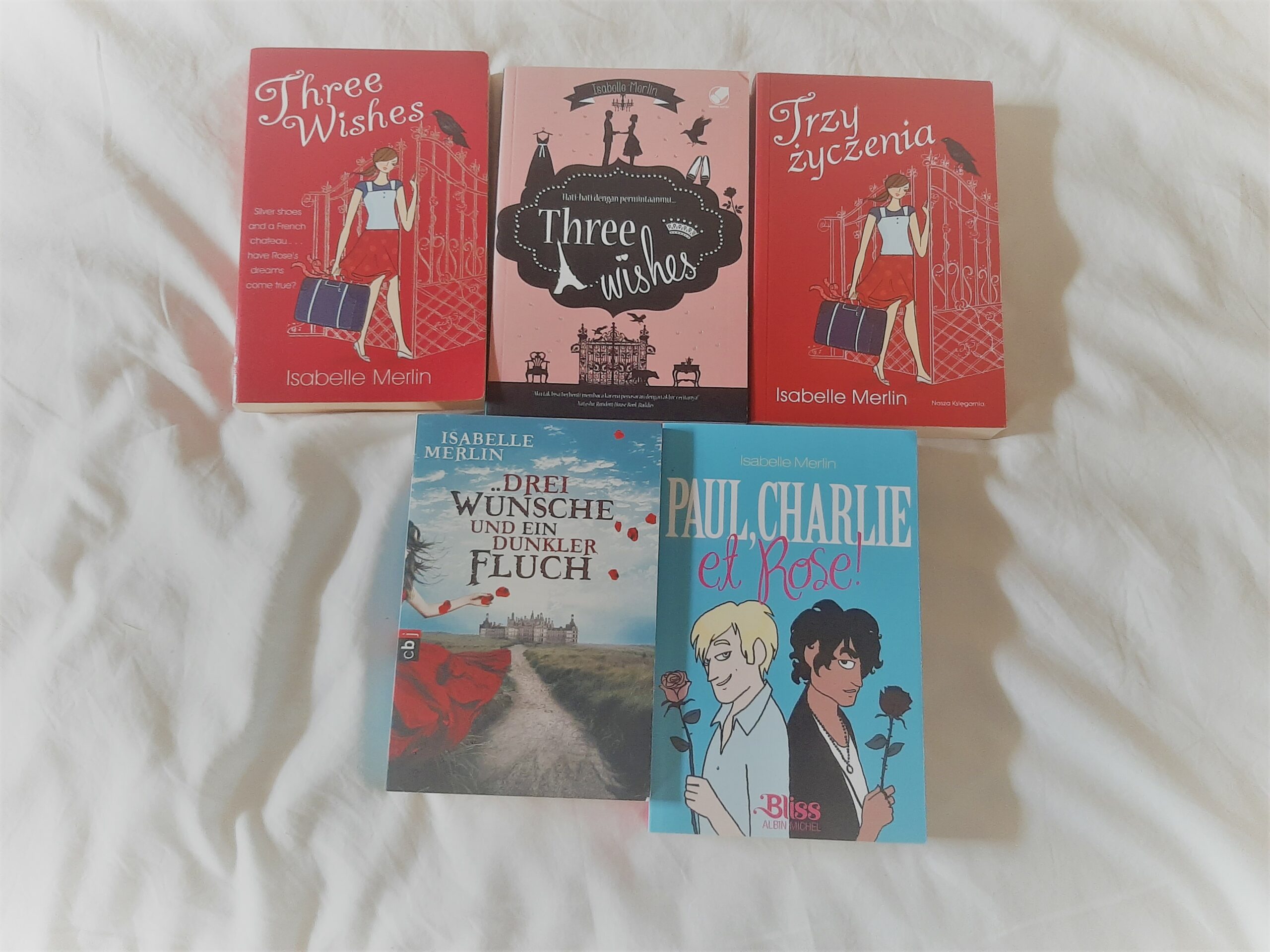
For example with my YA romantic thriller Three Wishes, (written under the pen-name of Isabelle Merlin), of five different editions(see pic) two(the English-language one and the Polish-language one) had the same cover and same title; the Indonesian-language one(middle one in the first row) had a different cover but the same title(interestingly enough, the title stayed in English, though the rest of the book didn’t); and the French-language and German-language ones had both different covers AND different titles (and each very different from each other, too!). For each edition, the publisher was looking at their market and what would work for them. So they will often focus on aspects of the story which may have particular appeal for their audience: for instance, in the case of the French edition, the love triangle is most forcefully brought out; in the German edition, it’s the mystery and enchantment; in the other three, it’s wish-fulfillment and French elements that dominate. The novel itself has all those things within it, but also a slightly spooky, Gothic aspect that’s not really brought out in any of the covers, aside perhaps from the German one.
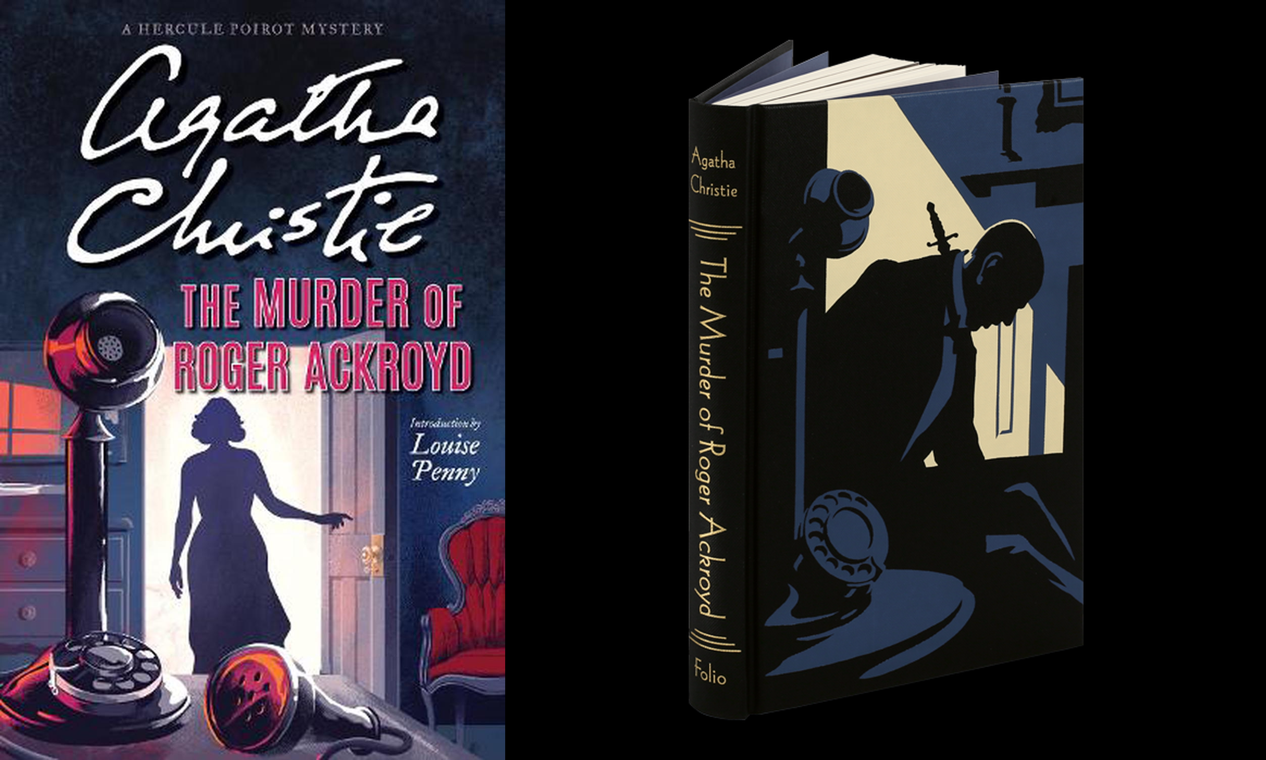
Comparing covers of the same book across time too is an interesting exercise: just have a look at the various covers for Agatha Christie’s great classic, The Murder of Roger Ackroyd, which I have inserted below. The first collection consists of covers from 1926 (date the book was first published) to the 1970’s; the second features much more recent covers, and the third is of two contrasting recent editions: a paperback edition (published in December 2021), and a lovely illustrated hardcover Folio edition. By the way, this is just a small selection of the many covers of this book that have been created for the English-language market since 1926. (And that’s not even looking at editions in other languages!)
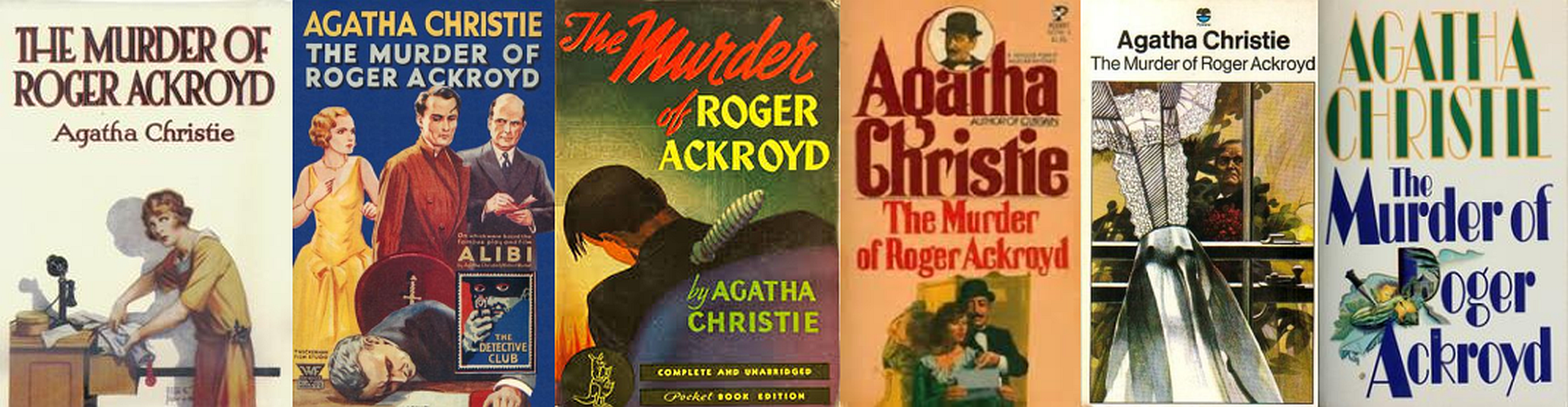
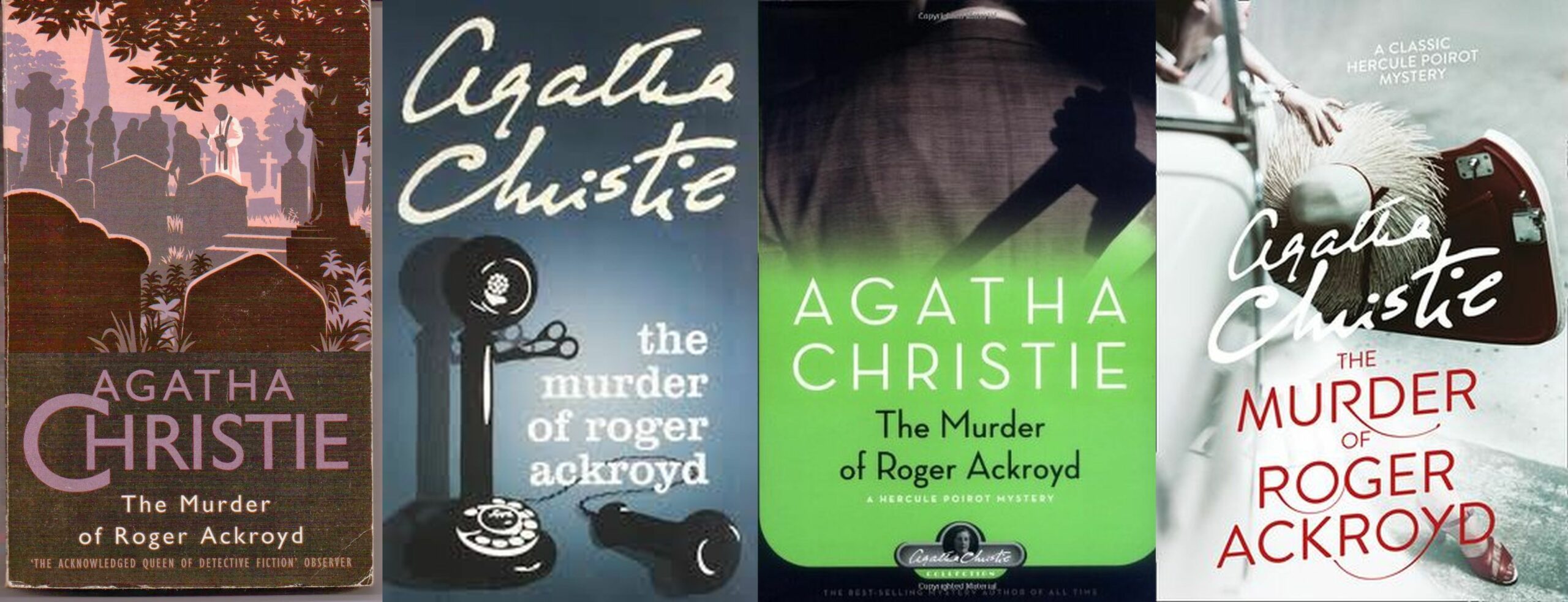
It’s really interesting to see the shift in colors, fonts, and what designers have chosen or been briefed to feature: the earlier ones focus on people, the later ones shifting away to landscape, objects or just decorative graphics, and then very recently a return to people, even if in silhouette. The look too changes: from illustrative to brash to classy and everything in between. To my mind, it represents a fascinating little snapshot of not only book design fashions over the decades, but also the Zeitgeist and social atmosphere of each period covers were created in.
What do you think? Which of the Christie covers work for you? And what about the covers of Three Wishes? And finally, what’s your experiences with book covers—good or bad? If you have particular examples of covers to share, do consider linking to them in your comment: I’d love to see them!
Born in Indonesia of French parents, and brought up in France and Australia, Sophie Masson is the award-winning author of over 70 books for children, young adults and adults. Her latest books include Sydney under Attack (children’s historical novel, Scholastic Australia, 2022) A Hundred Words for Butterfly (adult novella, ES-Press, 2022) and Cock-a-doodle-doo (children’s picture book, (illustrated by Kathy Creamer, little Pink Dog Books, 2022). In 2019, Sophie received an AM (Member, General Division) award in the Order of Australia honours list.


I love talking book covers. For me, it’s one of the first things that attracts me to a book. When I was working with my publisher’s designer, we went back and forth trying to find a cover that wasn’t too “on the nose” yet suggested the story of three women whose lives intertwined. I think we came up with a great design in the end that’s gotten compliments (https://maggiesmithwriter.com/) but it took a lot of back and forth. When I talk to readers about why they don’t finish a novel, one of the primary complaints is a cover that doesn’t accurately depict the genre or has little to do with the plot or the characters. On the other hand, covers that catch your eye out of all the others in the stack or on the computer screen can sell a book. See a book that releases next week, “Mouth to Mouth” by Antoine Wilson. Evocative, subtly ambiguous, yet accurately conveys the mysterious story within. (and by the way, I love “The Murder of Roger Ackroyd”. My copy is the fourth from the left on top with the tiny portrait of Poirot in the middle)
Thanks for your comments, Maggie. Your book cover looks fabulous! Yes, definitely worthwhile all that back and forth to get the right result..
You’re absolutely right, a cover can really mislead or disappoint readers, if the contents don’t match up to the impression given by the cover. It can mean that that author’s other books aren’t chosen by readers…
That’s certainly a striking cover for Mouth to Mouth! And the story sounds very intriguing.
Ahh yes, that famous “Don’t–” that only means it’s too easy to judge the book by the cover. And so that there’s more underneath that cover — but it also means the cover damn well ought to be one worth judging by.
And a proper cover isn’t only about the book. More than anything it’s a statement of belonging, that both the artist and the writer or publisher are that genre’s Kind Of People, and (are competent enough to) present the book in those readers’ visual language. When we get a chance to reach the tribe, of course it’s what matters.
Absolutely right, Ken, re needing to reach our book’s tribe: that’s exactly what makes the right cover so important.
Everything can be done badly, of course, but there is a new category of cover art which adds the author’s intentions on how to present his own work, which give a potential purchaser another bit of the puzzle of whether the story will please, and which kind of reader it will appeal to.
And if readers learn to identify that art out of a sea of covers from a genre, the author has achieved a brand.
This clue is missed if the book’s cover is produced by anyone other than the writer – whether or not the writer had any input.
Hard to see your five book covers for the same book as a brand! Sales are probably more important, and each publisher/translator knows their own market, but I wonder what your gut tells you when you see your own work presented so differently, not that I would admit to such thoughts in a public forum if it were me!
That’s a very interesting comment, Alicia! You are quite right that a certain type of art may represent a certain writer across the range and readers might expect that as a brand or visual clue. I guess I have written across so many genres that there is no particular style of cover associated with my writing, and in the case of Three Wishes, that was actually the first of my ‘Isabelle Merlin’ novels so it was like a brand new author as far as most people were concerned.
Book covers greatly influence my choices as I browse the library shelves. Now we need a Writer Unboxed author to tackle titles. This last month I’ve read three fairly new releases with titles that had absolutely nothing to do with the story, and/or were so mundane I wouldn’t have chosen them except for the fact that I knew the author usually delivered a good story.
Thanks, Sally. Yes, titles: another super important first impression! Hmm, maybe in my next post :-)
I believe a writer needs to be thinking about cover art as the story is written. It’s that important. If your story doesn’t have anything in it that will play well on the cover, there’s something missing in the writing. Three Wishes looks like a fun, light romance with travel. If that’s what it is, then the artist hit the mark. The next to last Agatha Christie cover with the woman standing in the doorway would make me pick up the book. I think it has the best drama of the lot.