
How to Avoid Cover Design Pitfalls for Indie Publishers
By Ray Rhamey | February 20, 2014 |
As self or indie publishing grows and grows, more and more of us compete for a buyer’s attention on the Internet on both retail and industry websites.
- Amazon.com
- Barnes & Noble.com
- Kobo.com
- Smashwords.com
- Shelf Awareness.com
Nowadays authors are calling on CreateSpace, Lulu, and other places to design their own book covers. Others do it on their own, utilizing stock images and free fonts—I do a workshop for writers’ conferences on how to design a book cover for $50, and that includes sophisticated graphics software. Other indie writer/publishers utilize the services of independent designers such as me.
Cover design creative goals
I’m going to show you screen captures from how books are presented on the search pages of major online vendors but, before we get there, I want to give you some goals with which to judge the effectiveness of these covers.
- Image, title, and author name are clear at small web sizes
- Design helps the title give an idea of what the book is about
- Design helps the title raise a story question
- Design helps the title create an emotion or mood
- Design helps the title create “fit“ by evoking the genre at a glance. Romance novels look a whole lot different from thrillers, thrillers are far from fantasy, and so on
- Design helps create your brand– I’ve run into one thing with my indie writer and small publisher clients—the authors often do not want to see their name large on the book. If you ask me, that’s a big mistake if you’re going to keep publishing more books—when you succeed, your name is part of your brand and part of what sells a book. So why would you not want to give readers a key part of your brand in a way that they can easily read, remember, and recognize?
Yes, our books are judged by their covers
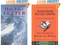
Here’s how bookstore owners and buyers see book covers on the Shelf Awareness website, a site that serves the brick-and-mortar side of book retailing.
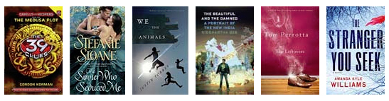
Some are eyecatching even at this tiny size, some don’t make much sense. Some show both title and author clearly, some just the title, others neither. A bookseller will be scanning this page, and the covers that attract attention will get the click for a review and more information about the book. Which ones caught your eye?
Here are search-page result images from online vendors:
Amazon.com
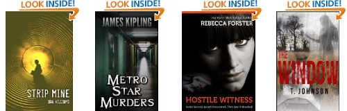
Barnes & Noble
Kobo
I think the author on the left flunked the name/brand goal. Compare the two covers from Kobo with the same covers on Amazon.com
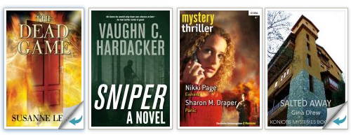
Smashwords

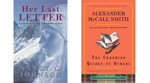
Here’s a comparison of a cover that I thinks works on the three big online stores:
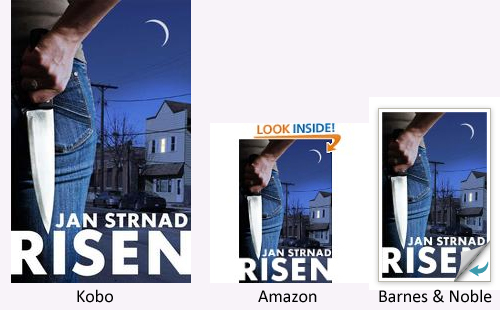
However, note how the Barnes & Noble graphic (right) intrudes on the title at the bottom. Might be something to keep in mind.
Authors CAN design strong, successful book covers, but there are things they should do:
- Research their genre in the online stores. Look for colors, type fonts, how graphics are treated to get an idea of how to both distinguish your book and to make sure it is a recognizable member of the genre.
- Make your name strong and clear
- After you finish the first draft of your cover, reduce the size to see how it plays. I recommend looking at it 100 pixels wide with a resolution of 72 dpi/ppi, the normal monitor screen resolution. If it doesn’t meet the creative objectives above, rethink.
A caveat for do-it-yourself writer/designers: when you design a book on your computer, you use a nice, large image, as you should. And high resolution for images and type, as you should. Everything is easy to see. But if you don’t look at it in miniature at screen resolution, you may miss your one and only opportunity to snare a new reader.
One more tidbit: if you’re working with a graphic designer, I came across this list of 10 words your graphic designer wishes you knew by Rebecca Swift, on iStock. She defines and explains
- Swipe file or tear sheet
- Proof
- Negative space
- Alignment
- Serif
- Copyfitting
- Resolution
- Raster image vs. vector image
- Hero graphic
- Color
For what it’s worth.
Ray

Ray Rhamey is the author of five novels and one writing craft book, Mastering the Craft of Compelling Storytelling. He’s also an editor of book-length fiction and designs book covers and interiors for Indie authors and small presses. His website, crrreative.com, offers an a la carte menu of creative services for writers and publishers. Learn more about Ray’s books at rayrhamey.com.


Thanks, Ray! This is great information for us writers who feel out of our depth when we think about graphics and cover design.
Interesting post, Ray. You are right, designing a book cover is a talent and skill quite outside the talents and skills of a writer for most of us. I think if you want a professional looking cover, it’s critical to consult with a person who knows graphic design elements and has that artistic eye for balance, density of color, and fonts styles. I like Joel Friedlander’s blog. He has a monthly ebook cover design award and shows you good covers vs bad covers. Really helpful in learning some of the basics for us nongraphic-artsy types. https://www.thebookdesigner.com/
This is fantastic — thank you, Ray!
“When you succeed, your name is part of your brand and part of what sells a book”
One thought to add to that: It should not be the only thing on your cover. Yes, you see that on a lot of covers, and those will draw shoppers who know your name.
But! That’s all it will draw (well, maybe those who wonder who whats-his-face is and why is her name so big?). The cover still needs those other elements to attract readers who don’t know who you are.
I’ve see many books that fail to market books to new readers once the author has a bit of name recognition.
I think Ray’s reasoning applies to any image you put up on the web – whether it’s a book cover, headshot, or photo to accompany your blog post. It’s important to recognize that those images will be seen in both large and small formats, and you want to be aware of how they’re going to be perceived at thumbnail size as well as in their full-scale versions.
I designed the covers for both my novels myself, from snapping the photos to designing the text. I used free versions of Picassa and paint.net and have gotten many complements on both. Covers aren’t as difficult as many writers believe and they don’t have to cost a lot. I agree they can help make or break the book, although some of my favorite books have, to me anyway, not so great covers.
Very helpful pointers. I have just become aware of the importance of having the author name as large as possible. Looking at all the examples you posted, I can see other factors to keep in mind as well. Thanks for the advice.
I couldn’t find cover art or stock images that both the story and the genre of my novels. So I designed covers that fit the stories. In spite of many compliments on both covers, sales have been poor.
There’s always something to learn.
I hadn’t realized the Barnes & Noble bottom corner affects some prime real estate on the cover: the Western eye enters a design top left, and exits bottom right when reading – and will run right into the problem with the right bottom corner.
‘RISEN’ loses 20% of the title that way. You could also lose a significant fraction of your name if you put it on the bottom.
Amazon’s ‘Look Inside’ is a line over the image, so I hadn’t noticed the possibility of interference from the vendor.
Thanks for pointing that out.
As the former owner of a small, indie bookstore, I certainly came to appreciate the importance of covers. How important? Publishers pay bookstores (called co-op, for cooperative advertising, although the financial difficulties of the past few years have seen some curtailing of co-op money) for end-cap, center table, or step-ladder, face-out placement. When discussing disappointing sales of a specific title, one of the first questions a rep will ask is if the book is on the shelf face-out.
Another frequent question is what section (genre) the book is in, a decision that can be helped or hindered by the cover. For example, a book indentified as “Sci-Fi” but that has “Romance” cover art will generally struggle regardless of where it is placed, especially for an unknown author, as Sci-Fi readers are not looking for Romance, so will pass over the book based on the cover, and Romance readers might pick-up the book but most won’t get past the blurbs.
For over fifteen years I watched readers browse and make purchase decisions, and, like it or not, books are judged by their covers. While this is especially true for new authors, it also holds for those with wide name recognition. A good example is “The Blind Side” by Michael Lewis. When it first came out in hardcover it had a black cover with “chalk” drawings of his name on the upper half, the x’s and o’s used to diagram football plays in the middle, and the subtitle, “Evolution of a Game” at the bottom. While it was placed in my “Bestselling Authors” section along with some of his other books like “Liar’s Poker” and “Moneyball”, and in spite of having a good fan base in my store, most people took one look at the cover, thought it was a history of football, and passed it by–they wouldn’t even take time to read the blurbs. Handselling was basically the only way to sell it (which is not something an author should rely on bookstore staff always being able to do). When it came out in paperback, it had a new cover.
From my experience, the truism “you never get a second chance to create a good first impression” definitely applies to books, and the cover is the first impression.
Many thanks for sharing your insights, CK. Very helpful.
Great article. I was thrilled to see that the cover of my book was used as an example of a good one.
Vaughn C Hardacker
author of SNIPER
And I was thrilled to see a design that works so well. Good on you.
Timely article for me. Thank you.
Any thought on abstract vs. literal elements? Other genre specific suggestions?
Not really, Tom. When I design a cover I’m mindful of genre, but the story itself is what drives the cover design. I’ve used both photography and stock art, realistic and interpretive designs.
Very helpful information, especially the vocabulary we should know.. I bookmarked it for future reference.