VOTE in the WU Logo Contest
By Writer Unboxed | January 31, 2012 |
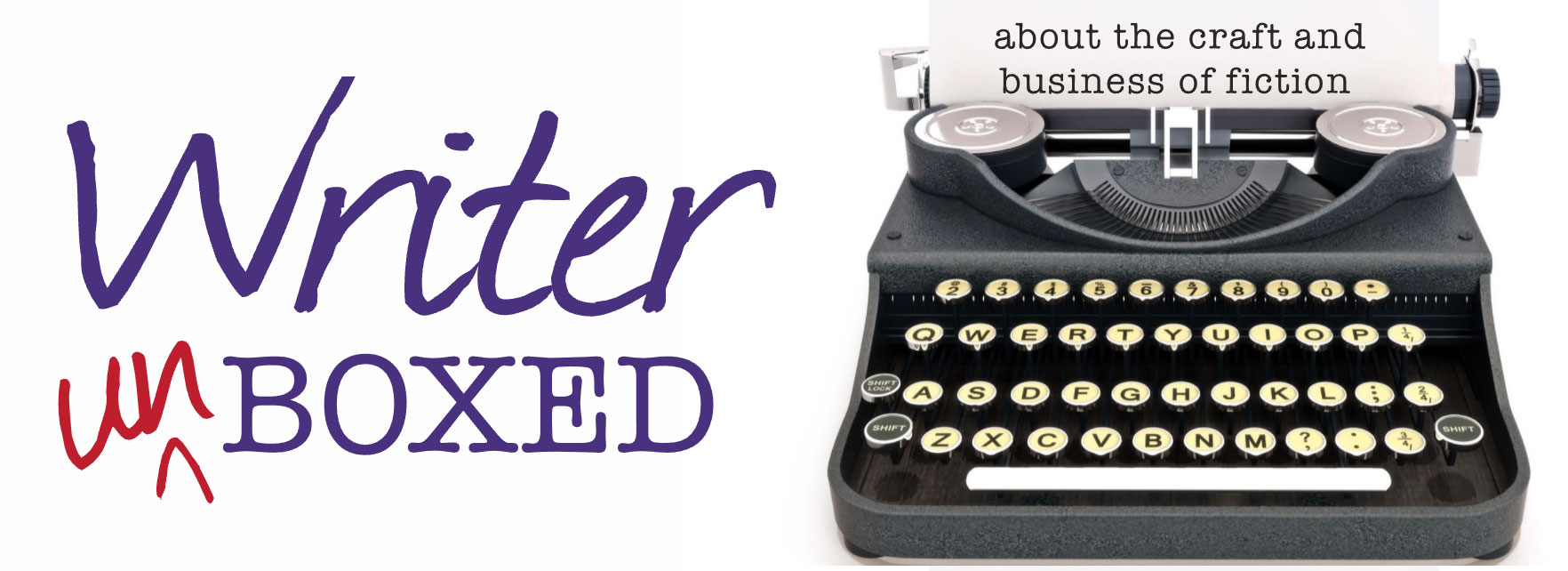
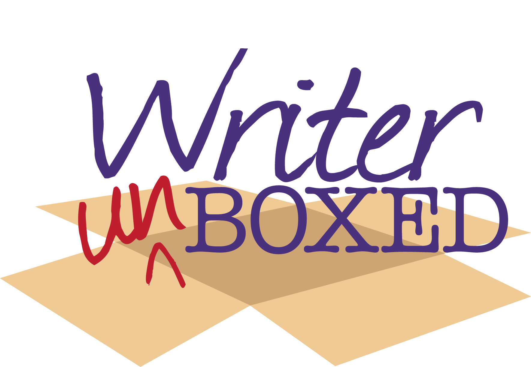
Thanks to all who contributed logos in the Writer Unboxed logo contest. The competition was fierce, with forty entries vying for our affections. In the end, we gravitated toward a few logos that used imagery to show a sort of unboxing. Here’s what we loved, now you tell us what you love.
Take a look at our top three picks, then vote using our PollDaddy poll below. (Votes left in the comment section will not count.) One vote per person, please. Polls close at 8 p.m. tonight, EST.
UPDATE: The poll is now closed. Congratulations to Logo #1 and its creator, the talented Kristy Condon! Missed all the action and want to see the original contenders? Check below the fold.
#1. We loved that the box is positively obliterated in this one, and the use of color.
#2. We loved the book imagery combined with the boxy “u.”
#3. Again, we loved the boxy imagery here, and the use of color.
One last view of all three logos, this time with each at 100 pixels wide — an Internet standard.
The poll is now closed. Congratulations to Logo #1 and its creator, the talented Kristy Condon!


They all look great. Glad for the fresh look.
Love that you’re always evolving and growing!
Very nice selection. I voted. I feel like I’m in Florida.
A good selection. Any one of them would work. Nonetheless, I voted.
3 great designs here. tough competition but whichever wins will look very nice at the top of the page
Very nice! Before I vote, just to clarify, you won’t be using this as a favicon? (The little doohickey that shows up to the left of urls.) Is that correct?
Hi Jan, it hasn’t been discussed, so I can’t really answer that one.
Great choice of colours – love the design.
Congratulations, Kristin. Great design.
Thanks for the votes, everyone!
Congratulations Kristy!